

- 2 concepts · 2 revisions
- Color palette & typography
- Simple brand guidelines (PDF)
- Social banner (LinkedIn, X)
- Brand.md token file
Logo design guide
A logo has one job: to identify the brand. Not to explain it.
The exact three-step process I use with real clients: strategy first, then references, then sketching before any software.
To design a logo, start from a brand strategy, gather references that align with it, then sketch by hand before opening any software. Refine the strongest direction in a vector tool and test it in real contexts before you commit.
Most founders end up with a generic logo because they built it themselves in Canva or copied their competitors. That makes it almost impossible to stand out in your market and carve out your own space.
A good logo only has 1 goal: to identify the brand, so being memorable and different from the competition is a must. Based on my experience working with multiple clients, it doesn't need to explain what your business does, trying to do that is actually one of the most common reasons logos end up looking generic.
Note: This guide focuses specifically on designing the logo mark: the symbol or icon. Typography, color, and the full brand system are a separate process. If you want the whole system, see what a brand identity package includes.
Step 1: Start with brand strategy
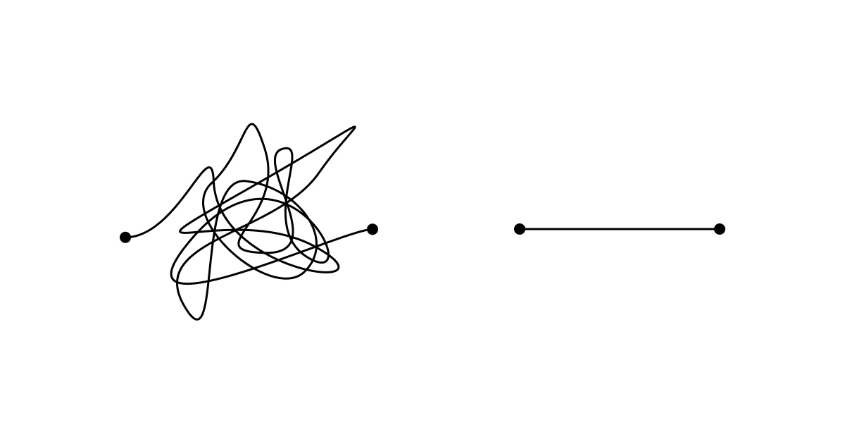
Before touching any tool, you need a brand strategy in place. Having a strategy behind your design dramatically increases its chances of succeeding in the market.
A complete brand strategy covers many elements: purpose, mission, vision, values, positioning, competition, personality, identity, and the tone of voice the brand uses to express itself.
That's a lot of work. At the start, the most important elements are your audience, your competition, your purpose, your positioning, and your values. That already gives you a strong base to work from.
Here are some questions that help you get to know a brand before designing anything:
- What is the product?
- What problem does it solve?
- How is it better than competitors?
- Who is the target audience?
- What are their pain points?
- What does their profile look like?
- What is the brand's mission?
- What are your values?
- If the brand were a person, what would their personality and characteristics be?
- Are there colors you particularly like or feel connected to?
- Are there colors you hate?
- Do you have a specific idea in mind?
- What logos do you like?
Still deciding on the name itself? Work through how to name your brand first, the name and the mark are easier to build together.
Step 2: Research and gather inspiration
Surrounding yourself with the right references gives you ideas and helps you make creative connections. The references you use should always align with your brand strategy.
It's also important to study your competitors visual identities, so you can stand apart and create something different. If every brand in your space uses the same colors, that's your signal to go somewhere else entirely.
For good references, I recommend Cosmos, Pinterest, Brand Archive, and Logobook.
Step 3: Sketch before you open any software
Based on my experience designing multiple logos, one of the most intuitive ways to start is with a keyword exercise.
Write a list of words that belong to the brand, then create connections to other words. This opens up your thinking and surfaces ideas you wouldn't have found otherwise.
From there, grab a pen and paper and draw whatever comes to mind.
No judgment, no fear. In the beginning it's completely normal to sketch things that already exist or don't look great, that's not the point. The goal is to relax and let your imagination lead you to places you didn't expect.
A great way to push toward something unique is to pick 2 or 3 keywords from your list that represent an object or concept you can draw. Here are two examples.
Example 1: rocket, aim upward, speed
With these three words you already have multiple directions.
For "rocket" you could draw a rocket, more or less abstract. For "aim upward" you could use an upward arrow. For "speed" you could use a lightning bolt, or if you're working with typography, italic lettering to suggest motion.
The ideas might seem basic at first, but they're a solid starting point to build from. You can also mix concepts: a rocket built from an arrow, an arrow that becomes a lightning bolt. That's where distinctive logos start to emerge.
Example 2: mythical creature, sleep
When you think of mythical creatures, most people go straight to dragons, phoenixes, unicorns. And sleep brings to mind words like relaxing, restorative, comforting.
But combine the two and you start moving in a more unexpected direction. Are there mythological figures connected to sleep? Hypnos, the Greek god of sleep. Somnus, his Roman counterpart. A winged god, wings! They suggest freedom, floating, the feeling of drifting in a dream, etc.
From there the associations keep building. A winged creature carrying the cycle of the sun and moon. The celestial rhythm of sleep and waking. You could imagine a brand mark, a winged figure holding the sun and moon, that also works dynamically in an app, switching between sun and moon depending on the time of day.
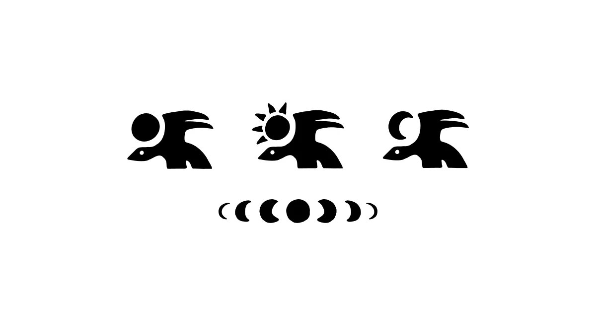
After spending time with this, and it can take several hours, you should have a few interesting directions to work with. The next step is to refine them, first on paper or similar (I use an iPad with the app Procreate), then inside a vector tool.
Once your logo is clean in the vector software, test it across different contexts. You can drop it into my own logo preview tool to see it on a real screen, or use symbl.space, which renders your SVG or PNG across multiple real-world applications.
How I do it with clients
The steps above are the core of it. Here's what that looks like when a client hires me.
The questionnaire. After picking a package, the client fills in a form that gives me enough to start. It includes around 30 logos to sort into ones you like, ones you don't, and ones you're not sure about.
Under that, there's space to explain why, and to add your own references. That part tells me more than any list of adjectives.
Research before design. I don't start designing right away. First I dig into the brief: what you're looking for, and how you want to position yourself against your competitors.
The goal is to make decisions based on real data and what's best for the company. Not on what I prefer, or what your uncle prefers.
First concepts in 24 to 48 hours. I send back all the research along with the first concepts built from it. If one of them clicks, we can refine it, explore a few variations around it, or go with it as is.
Mark first, then the system. I focus on the logo and the brand icon first. Once that's settled, I move to the rest of the identity: colors, typography, illustration, and photography.
Conclusion
Designing a logomark can seem simple, it's just a mark, after all. But a logo that stands the test of time needs to be built on strategy, research, and intentional decisions.
If you want to design your logo yourself, now you have the process. Weighing whether to pay someone instead? See how much a startup logo should cost and how AI logo generators compare to a designer. If you'd rather have it done for you, let's talk about a brand identity built from scratch around your business.
"I hired Sofiane for my web app, he did an amazing job with the branding, I love that he understood the whole scope and adapted to my needs"
"I came for a logo but ended up with brand assets too. I had a few ideas in mind, and Sof did those, but also created a direction that was super fun and fit me very well, even I didn’t know I needed that. Recommended!"
"Sofiane put a ton of care and effort into helping me rebrand my design studio. He was generous with his time, open to feedback, and genuinely invested in helping me find the right direction. His creative insight and advice gave me a much clearer vision for the brand. I’d recommend him to anyone looking for a thoughtful, dedicated designer who cares about their business."
how it works
Simple steps.
No stress.
- 1
Brief & Discovery
Right after you pay, you get a focused questionnaire. No discovery call, I start the moment you send it back.
- 2
Design
First concepts within 24-48 hours. Share your comments, I'll refine them.
- 3
Delivery
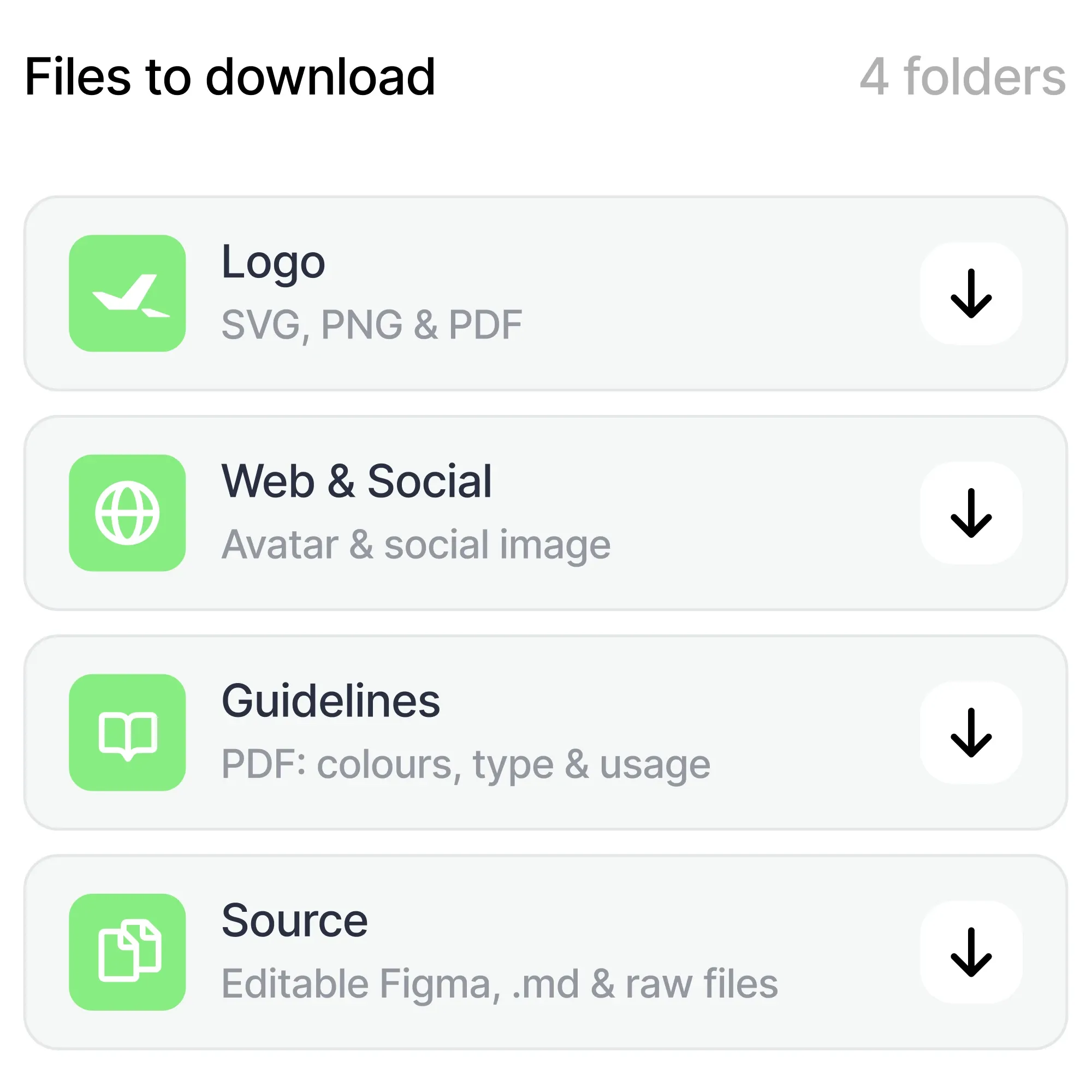
Every file you need: SVG, PNG, PDF, MD, Figma. Organized and yours to keep.
Pricing
Professional, without the agency price tag & faster.
Flexible plans, from logo design to identity systems and more. No quotes, no back-and-forth, choose one and I start today.
Essential is the logo and launch basics. Core is the full brand system.
- 3 concepts · 2 revisions
- Full logo system
- Color palette & typography
- Complete brand guidelines document
- Full social & profile assets
- Mockups
- Editable Figma + brand.md
Custom
From logo, branding & illustrations to a website live, tell me about your project and I'll scope it.
Custom
Let's talk- Illustrations
- Web design
- Web development
- Reviews
- Pitch deck
- Mockups
- Social media assets
- And more
You can select anything from this list. You can also send me an email to talk about your problem and I'll scope it.
How do you design a logo step by step?
Three steps. Start from brand strategy so you know what the mark has to stand for, gather references that match that strategy and study what competitors already look like, then sketch by hand using a keyword exercise before opening any software. Refine the strongest direction in a vector tool and test it in real contexts last.
What makes a good logo?
Being memorable and different from everyone else in your category. It has to work small, work in one color, and still be recognizable when someone sees it for half a second. Explaining what the company does is not part of the job, and reaching for that is what makes most logos generic.
How long does it take to design a logo?
The sketching stage alone can take several hours, and that is before refining anything. A complete mark, properly explored and tested, usually takes days rather than an afternoon. My own fixed-price packages ship a full identity in 7 to 10 days.
Do I need to be able to draw to design a logo?
Not well, no. Sketching here is a thinking tool, not a drawing contest. The point is to get ideas out of your head quickly so you can see the connections between them. Rough, ugly sketches do that job perfectly.
Should my logo explain what my business does?
No, and trying to is one of the most common reasons logos end up generic. A logo exists to identify the brand, not to describe it. Apple does not sell apples. Being memorable and different from your competition matters far more than being literal.
What software should I use to design a logo?
Any vector tool works: Figma, Affinity Designer, or Illustrator. The software matters much less than the strategy and sketching that come before it. Open it only once you already know which direction you are building.