somn
brand identity, web/app design
How it started
This project didn’t start with a client or a brief. It started with a music playlist on YouTube and a blank canvas in Procreate on my iPad.
I have these sessions sometimes where I just draw with no goal in mind, no brief, no client waiting, nothing to deliver. Most of the time nothing “useful” comes out of it. This time, something did.
A creature started taking shape: flat, hand-drawn, carrying a sun or moon above its head. Part dragon, part bird, something that felt like it had existed somewhere before, in a cave painting or on the side of an ancient pot.
It was strong enough that I didn’t want to leave it as a sketch. So I did something I’ve never done before, I built the brief around the mark instead of the other way around.
Figuring out what it was
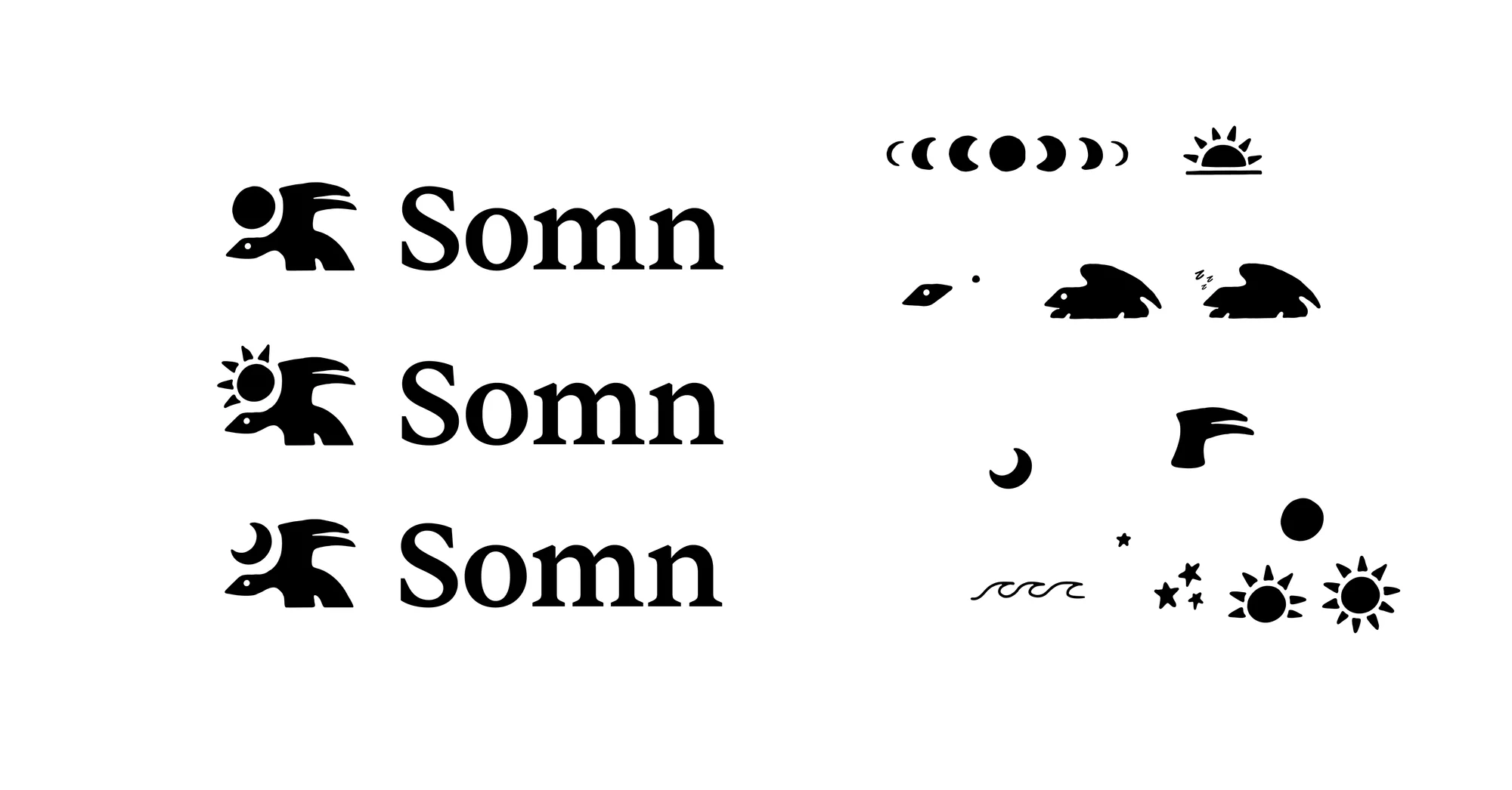
The creature carrying a sun and moon kept pointing me toward one idea:
The cycle of day and night.
Which pointed toward sleep.
Which pointed toward an app.
So Somn became a sleep ritual app.
Built for people who already know sleep matters but treat it as an afterthought anyway (guilty). The idea was simple: sleep isn’t something to optimize, it’s something to protect.
That one line ended up driving every decision that followed.
Finding the name
I wanted the name to actually mean something, not just sound good. So I went looking for something tied to mythical creatures/beings, the sun and moon, and sleep, all three at once.
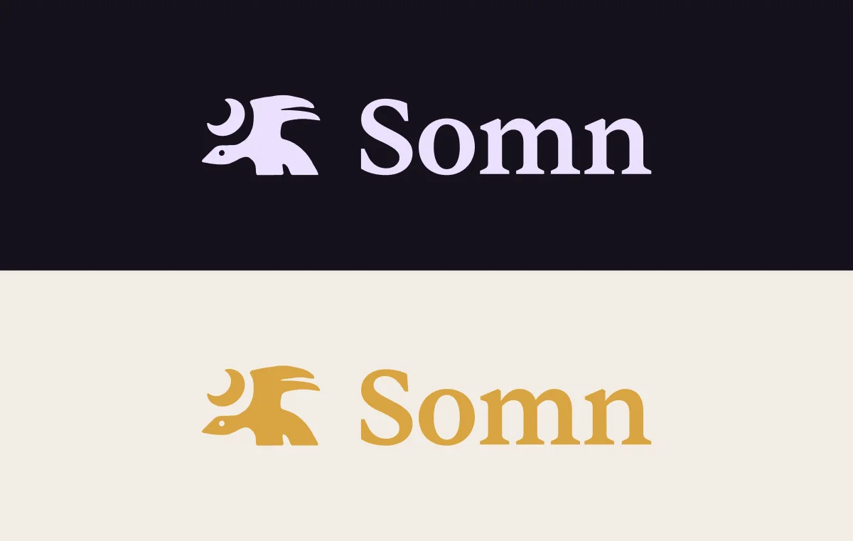
Somnus is the Roman god of sleep, equivalent to Hypnos in Greek Mythology. Winged, silent, moved through the world casting sleep on everything he passed over. Father of the Oneiroi, the beings who shaped dreams. That’s where Somn comes from, just the root, stripped back to four letters.
It earns its place because it connects everything: the winged creature, the product (sleep), and the celestial cycle (a deity who literally governs night).
The mark
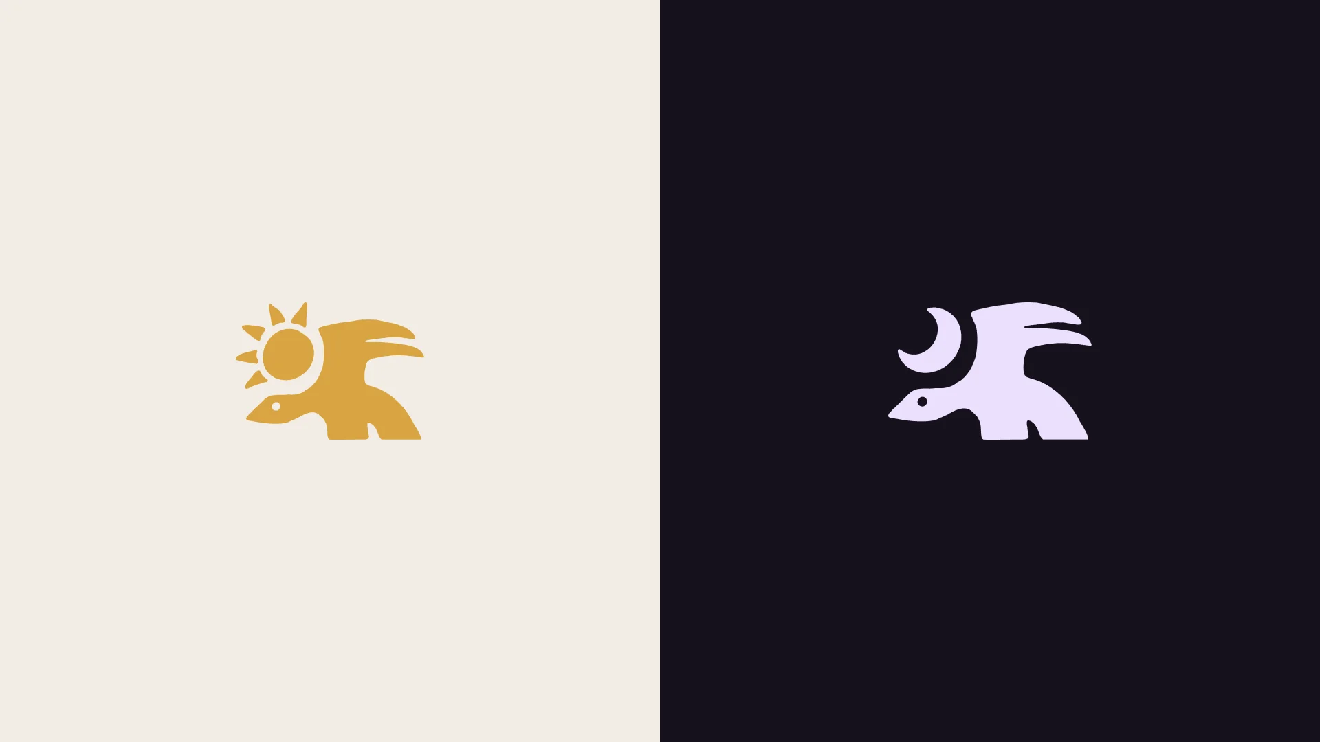
The creature went through a few versions during exploration, carrying a crescent moon, a full moon, and a sun with radiating rays.
All three stayed. Each one shifts the mood slightly without changing the underlying mark, which gives the logo system a built-in versatility that didn’t feel forced.
The hand-drawn quality was kept through vectorization on purpose. There’s a temptation when you bring a sketch into Illustrator (Affinity in my case) to smooth everything out until it looks clean and professional, I didn’t do that here.
The slightly irregular edges, that’s what makes it feel carved rather than designed.
Building the system
1 - Color
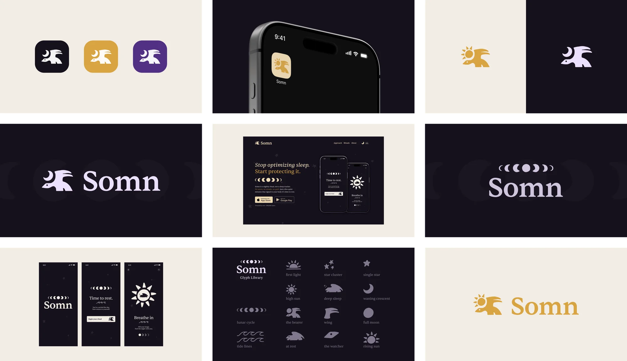
Everything runs on a simple idea: night and day. Deep aubergine-black for the night side of the brand, warm cream for the day side, and amber gold as the one accent color, used only where the sun needs to show up.
Both the purple and gold were developed into full tonal ramps so there’s enough range to build real UI without introducing any new hues.
2 - Typography
A single classical serif handles everything, headlines, display moments, UI copy, the wordmark itself. One typeface, used consistently. It carries the mythological weight without needing a second voice to balance it out.
3 - Glyph library
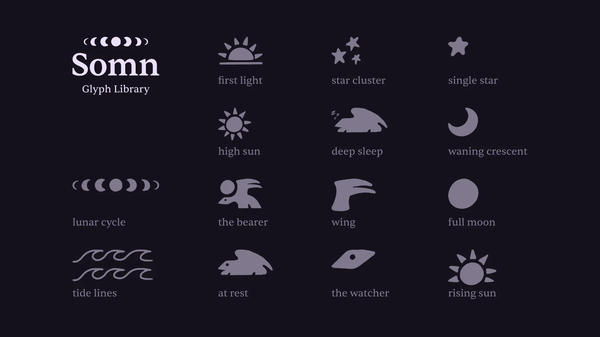
One of my favourite parts of this project. All the supporting illustrations, the lunar cycle strip, the waning crescent, the tide lines, the star cluster, the resting creature, were drawn in the same hand as the mark and catalogued as a defined set of brand glyphs.
Each one has a name: the bearer, the watcher, first light, deep sleep, tide lines. They’re not just decoration.
They’re a visual language that the whole brand can speak.
The landing page
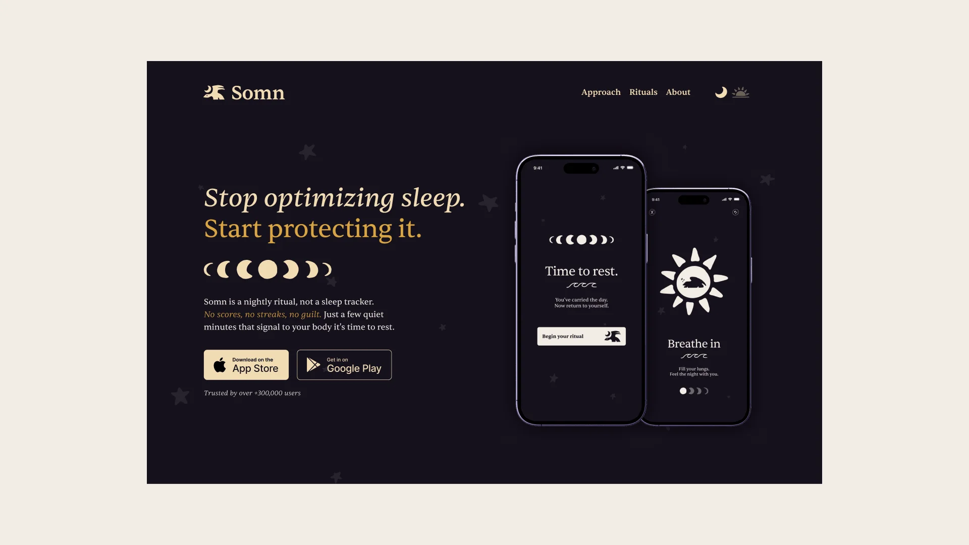
To push the brand into a real product context, I designed a hero section for the Somn landing page.
The headline, Stop optimizing sleep. Start protecting it. does the positioning work in one line: it names the problem, calls out the competitor approach, and signals what Somn does differently.
The app
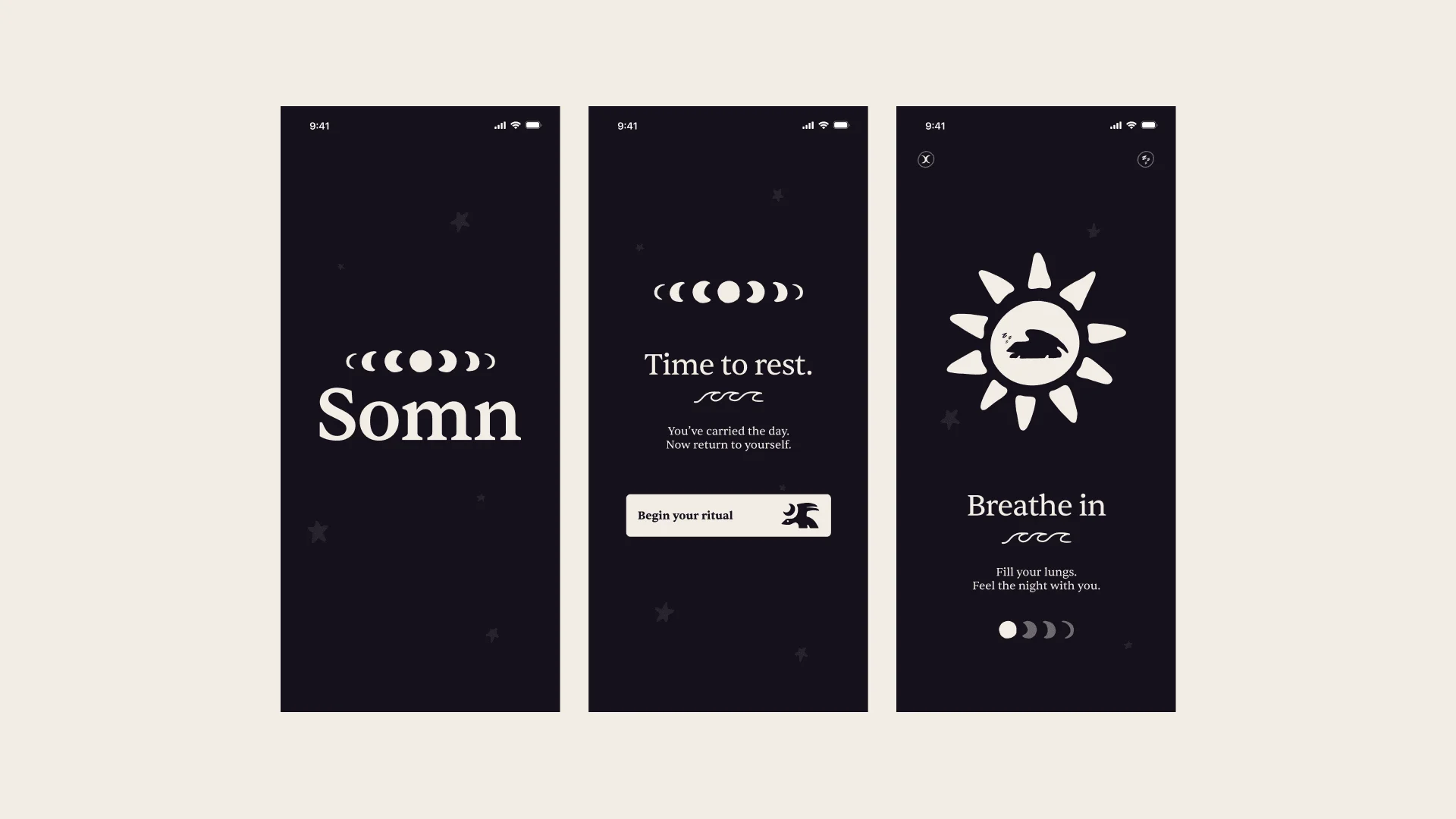
Three core screens built in Figma using the actual brand assets. The splash screen leads with the moon-phase lockup. The home screen keeps it sparse: current phase, one headline, one CTA. The ritual screen centers on a breathing moment.
One detail worth mentioning: the progress indicator uses moon phases stepping from full to crescent instead of generic dots.
Small thing, but in a brand built around mythology and cycles, even that should come from the same place as everything else.
Looking back
Starting from the mark and building outward turned out to be one of the more interesting creative constraints I’ve worked with.
Every decision had to earn its place against something that already existed and already had meaning.
If this were a real product I’d want to push the motion side of things further. The brand has a clear sense of how it should feel in motion, slow, drifting, nothing that snaps or rushes.
That part lives in my head for now. Maybe one day I’ll make it.
If you want to see the keyword exercise that led to this mark in the first place, I wrote about the process.