deadbeat
Brand identity, livestreamer analytics app with an attitude
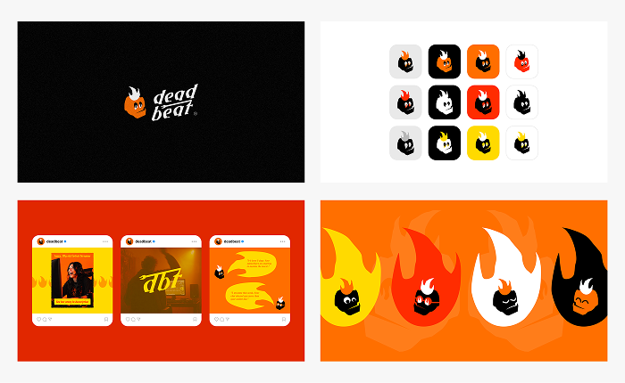
The sketch
Deadbeat wasn’t planned. It came out of a free sketching session (this time on the computer, not the iPad), music on, drawing for the sake of it. A skull with flames for hair showed up on the page. It had personality from the first stroke: rough, loud, like it wanted to shout at people.
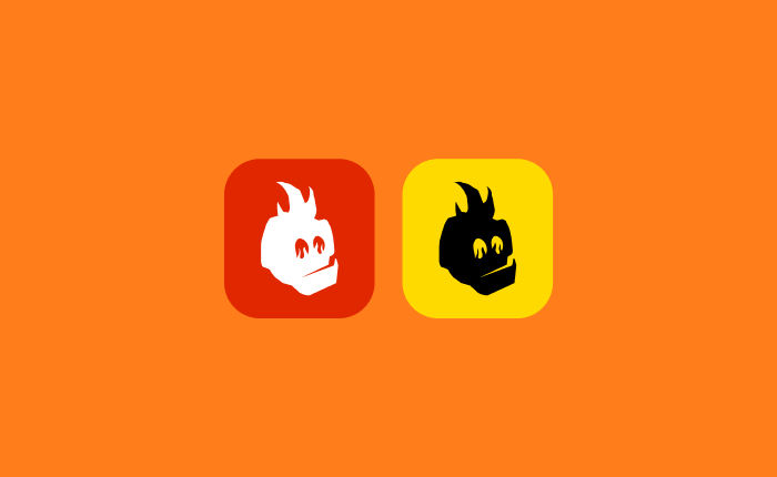
Finding the concept
The character came first, the product came after. The mark felt built to interact with someone, react to them, needle them a little. Streamer analytics fit: a space full of people who check their stats obsessively and could use a tool that actually talks back.
The name
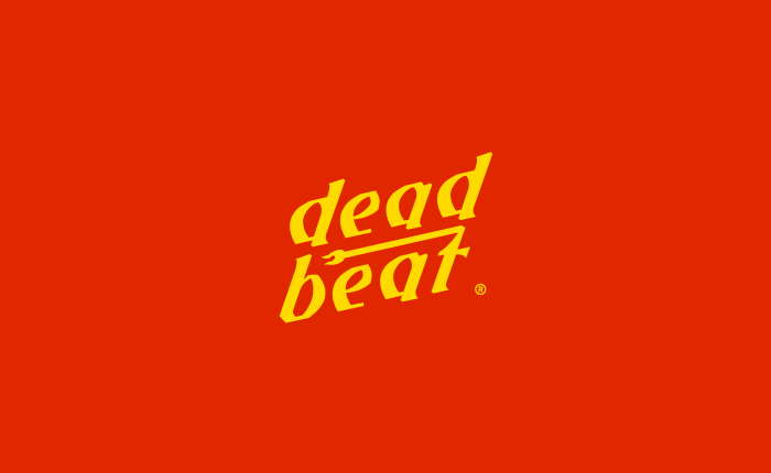
Deadbeat pulls from two places: dead, for the skull, and beat, for music and streaming. It also just matched the brand’s temperament, grungy, loud, doesn’t care what you think of it.
The mark
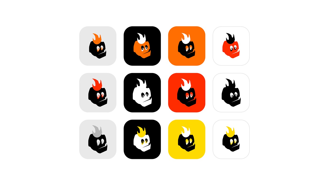
The mark barely changed from that first sketch. Most of the work went into range, not correction: different expressions, different colors, not a reworked shape.
The flame was in the original drawing. It wasn’t added to punch things up later. It was always the contrast and reinforcement for the mascot’s fiery, strong-willed personality.
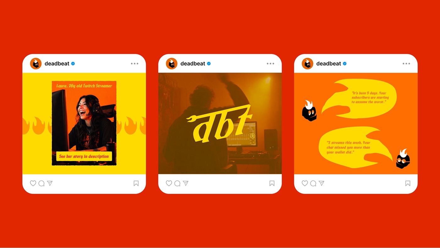
The expression set (smug, shocked, glasses, furrowed brow) came from thinking about how the mascot would get used day to day. Glasses on for advice moments. Wide eyes when a streamer does something dumb.
Each one exists so the character can react, not just sit there as a logo.
Voice
The hype-and-roast personality was there from the first sketch, before any product direction existed. It’s the reason this became a full identity instead of staying a drawing. The mark already implied how it would talk.
Color
Black and orange carry the system, with yellow and red as supporting tones. All four share the same fiery, high-energy read as the mascot.
Type
An early deadpan serif got tested and cut, not enough energy for a brand this loud. The final wordmark needed the same strength and temperament as the mark, which led to the current rough, bold treatment. A secondary script lockup, “dbt,” sits alongside it.
Reflection
The hardest part was finding type that matched the mark’s energy without flattening it. A few directions read too polished, too quiet for what the mascot needed.
Deadbeat is a character-led brand. The mascot isn’t a static logo, it’s something the brand keeps using: reacting, expressing, talking to its audience differently depending on the moment.